 Uniforms have always been a part of base ball. Yankees pinstripes, Dodger blue the good ones could go on and on but the best ones are not in this list, the horrible ones are on this list. The weird experiments of the '70's from the White Sox wearing shorts to the A's weird yellow and green alternates. Hope you like it.
No. 10 1971 Chicago White Sox Road Could somebody please tell the White Sox management of 1974 they are not the Reds! They're the White Sox, key word white. They didn't even have white socks! And the red hat just doesn't work for me. Chicago stick with the black and white.Picture from http://www.danhaman.com/
 No. 9 1977 Pittsburgh Pirates alternate Can the Pirates do anything right? All yellow! I mean come on they look like they're lemonade salesmen or something. plus the yellow helmet with the black bill, it's just weird. If I had to wear this jersey i strangle myself. Not kidding Picture from http://www.pittsburghpiratesgifts.com/

No. 8 1999 Pittsburgh Pirates one game only Wow Pittsburgh can't do
anything right. Could the horrifying pirate on the front get any bigger? And the 3 shirts, the red muscle shirt the short black tee shirt and the yellow tee shirt
and the polka dotted yellow bandanna just adds to it
 No. 7 1982 Chicago White Sox home You can sum up this jersey with one word.SOX. The Sox decked there players out in this hideous red white and
 blue uniforms in 1987. Carlton Fisk had probably the worst timing in getting traded
to the White Sox uniform wise having to suffer playing a year on Chicago's softball team then having to suffer 7 years of this of this! I'd kill myself. Picture from http://www.damorgue.com/
No. 6 1971 Baltimore Orioles alternate Imagine 9 pumpkins playing defense for
Baltimore in 1971 and 1972. It again proves the theory that a one colored uniform
a bad idea. The Orioles had some pretty nice uniforms in the 70's but this was not
one of them.
No. 5 1968 Oakland A's alternate This jersey is a great example of how yellow
and green don't mix. Mickey Mantle once said " They should have come out of
the dugout on tippy toes, holding hands and singing." Charlie Finley's brain must
have been out for coffee when he made up this idea, oh right he didn't have one.
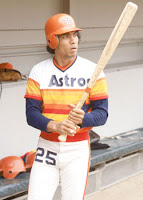
No. 4 1976 Houston Astros home The "rainbow jerseys" were just to much on
the eyes. And the blue number on the pant leg just added to it. And what
amazed me the most is that they kept it for over 10 years! And the helmets are just weird. Picture from http://www.watchmojo/.com
 No. 3 1999 Seattle Mariners one game only Doesn't Jr. look like a happy duckling in this picture. The only thing bigger than Jr.'s biceps is that 24 on his jersey. It was turn ahead the clock night in 1999 clearly the worst idea the MLB ever had. 20 other teams made a turn ahead the clock night jersey just weird. Maybe i wouldn't have hated it as much if they had there regular colors not that ugly shade of red. The teams that had enough sense not do make these jerseys were the Yankees, Cubs, Expos, Rangers, Reds, Dodgers, Blue Jays and the Astros which surprises me because I thought they would jump at the chance make a new ugly rainbow jersey . Picture by http://www.bleachereport.com/
 No. 2 1978 San Diego Padres alternate we all knew this was coming, the dreaded mustard uniforms. Probably the worst color you could put on a baseball uniform, except pink. To make matters even worse they had those
 horrible brown and yellow helmets that had the triangle yellow triangle in the middle. Just thinking about it gives me the creeps.
No comments:
Post a Comment